
藝術議題
- 西九文化區 / M+最新的專題文章如下。如欲閱讀有關同一議題的其他文章,可再點擊右下角資料庫的年份和月份。
「形流意動」:M+博物館設計藏品展 ∣ Shifting Objectives – Design from the M+ Collection
約翰百德 (John BATTEN)
at 3:55pm on 22nd February 2017
Captions:
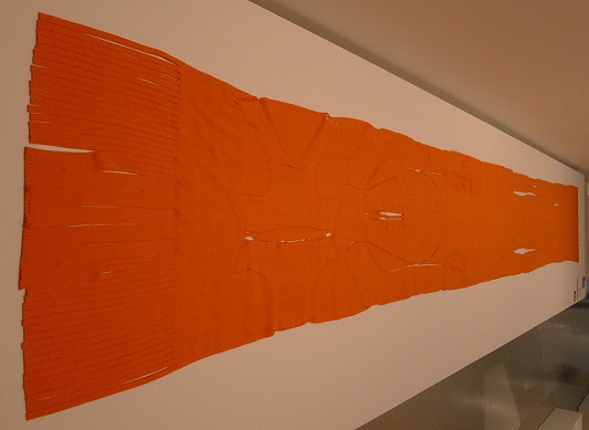
1. Miyake Issey & Fujiwara Dai, A-POC Queen, cotton, nylon and polyurethane, 1998.
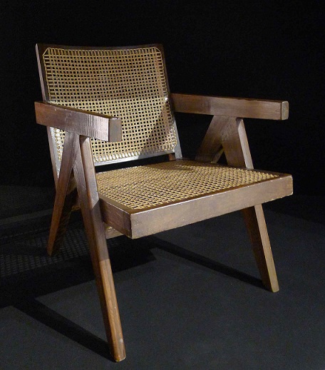
2.Pierre Jeanneret, Office Chair, Chandigarh, India, teak and imitation leather, circa 1958.
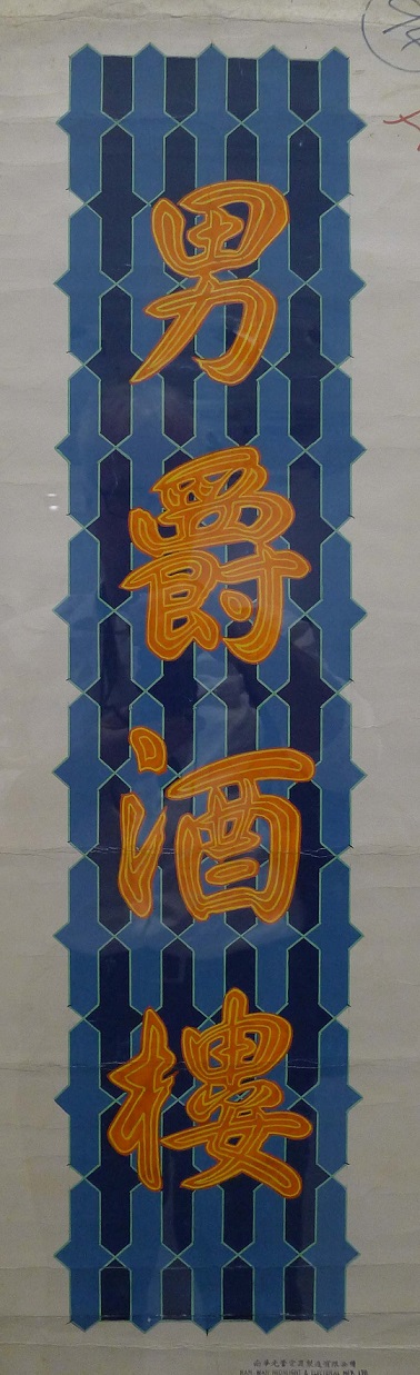
3.Nam Wah Neonlight & Electrical Mfy, Ltd., design sketch, Esquire Restaurant neon sign, paint and ink on paper, 1970s.
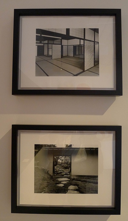
4.Ishimoto Yasuhiro, two photographs of the Katsura; Imperial Villa, Kyoto, Japan, 1954.
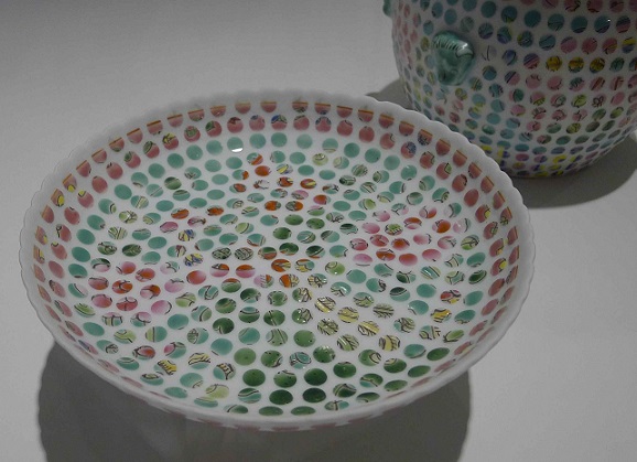
5.Hans Tan, Spotted Nyonya series, sandblasted porcelain, 2011.
All photographs: John Batten
(Please scroll down for English version)
形流意動」是剛落成的西九文化區 M+展亭首個設計藏品展。2014年,M+視覺文化博物館首次展出了其建築藏品,讓觀眾一睹具獨特風格的平面設計,概念圖像、攝影作品及建築模型。西九文化區 M+博物館的構建,建築師們競相獻技,其建築概念和模式至為重要。建築師的甄選是個棘手問題,本應按諮詢公眾意見的精神辦事,現政府不經諮詢,直接委派建築師嚴迅奇負責興建故宮博物館,這與上述精神相違背。興建博物館所用之地,原打算建設一個擁有一萬個座位的大型表演場。
「形流意動」的展品,為博物館日愈增多的藏品錦上添花。展品包括平面設計、工業產品、傢具、設計概念,展現了二戰以來亞洲現代設計概念的全貌。正如策展人陳伯康所言:「亞洲地區現有的設計論述亦有待豐富。」M+視覺文化博物館蒐集了該區的設計,邁出了新的一步。
這也是M+博物館的第二個展覽項目,第一個展覽項目為曾建華的「無」,他是2015年威尼斯雙年展的香港代表 (見《東西譚》第251期)
展覽的整個設計概念堪可玩味,完美的佈局,精心設計的廣告,精彩的說明,別出心裁的柔和燈光,沒有一處暗角,到處都可與觀眾互動。
這個盛會首尾兩端,自成一派,是橫跨現代主義的兩個展覽。
開頭的展覽是日本攝影家 Ishimoto Yasuhiro 的兩幅攝影作品,展示了位於東京都的十七世紀箱根町 (Katsura) 皇家別墅,一個極簡的室內風景和一座花園。這兩幅照片出現在1960年包豪斯(Bauhaus) 教師 Herbert Mayer 所著的一本書裡。日本歷史建築極簡、純淨的線條被 Mayer 視為同二十世紀現代主義的實用概念一脈相承。
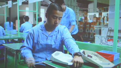
煞尾的展覽是一個比風筒稍大的一個塑膠製品,據說這物件或產品是專為錄像設計製作的。策展人說:「設計藝術家 Revital Cohen 及 Tuur VanBalen 和編舞家 Alexander Whitley 合作,設計了這個產品,其唯一的功用是將製作它本身的過程編成舞蹈。」這個產品出現在錄像裡,名為《75瓦特》,是我們對商品生產的程序及人格物化的後現代主義描述。在錄像裡,廣東省中山市一間工廠生產線的工人,彷彿按訓練有素的舞蹈動作裝配這個物件。正如費茲朗 (Fritz Lang) 1927年的著名作品《大都會》(Métropolis),它表現被機器控制的工人。《75瓦特》『反映了集體生產以及美其名為「效率」的人體機械化科學管理的作用。』這是對這個嚴肅的設計展覽的睿智而中肯的結論。
在這兩個壓陣的展覽之間,有一個詳細探討、介紹實用設計六十年及二十世紀現代主義的展覽。「形流意動」展覽分成「設計相互形塑」的四個區域,分別為「二次世界大戰後的日本」、「獨立後的印度」、「毛澤東統治下的中國」及「香港製造業及出口業的全盛時期」。第五部份是重新審視後現代設計,包括最新的實踐、深入探討手工製作、現成物的拼湊、數碼化設計、文字和圖像重組以及 M+設計團隊的不斷演進的複製概念。
參觀這些展覽是一件樂事。對亞洲不同區域及不同時代的比較,展現了這些地區的接觸、互動和對現代主義的呼應。日本平面設計師龜倉雄策 (Kamekura Yusaku) 為1964年東京奧運設計的海報可媲美石漢瑞 (Henry Steiner) 設計的《Progress Hong Kong》小冊子。兩位設計師均利用了公眾熟悉的視覺象徵,龜倉雄策利用一個紅太陽象徵「日本」,而石漢瑞則運用進步共和黨的紅、白、藍三色,突顯「Progress」一字。兩位設計師的風格簡潔有力。
瑞士裔法籍建築師勒.柯比意 (Le Corbusier) 被委任從零開始規劃印度昌迪加爾 (Chandigarh) 的城市建築。他的五十年代樸實無華的建築風格在這個地區蔚然成風。其繼承者有斯里蘭卡的Geoffrey Bawa 及柬埔寨的 Vann Molgvann。我們從中可見到一個嵌在城市水泥裡的一盞燈,簡潔彎曲的線條,在狹窄的背景裡顯得太大。勒.柯比意的合夥人 Charlotte Perriand 在她旅居巴西期間,亦利用跨國因素,為自己製作了一個小巧的燈座。她是從一次亞馬遜河之旅中獲取靈感的。她用一根扭成螺旋形的鐵棒,支撐幾個由日裔美籍藝術家野口勇(Isamu Nogushi) 設計的紙製燈罩。
勒.柯比意的堂弟 Pierre Jeanneret 擔任了昌迪加爾的首席建築師,為該市的高樓大廈設計了許多適用的辦公室傢具。他利用適合當地氣候的材料如柚木、藤條進行設計。他製作的傢具從概念和物質上都類似當時在亞洲,包括菲律賓、新加坡和香港流行的傢具。
香港霓虹燈招牌給城市一種獨一無二的氣氛和魅力。然而最近五年來,由於政府過份嚴厲的安全規定,許多高懸街頭的霓虹燈招牌已銷聲匿跡。這是十分遺憾的事情,現在只在博物館保存着它們的遺照。這些光輝耀眼,有時不停閃爍的燈光,儼然是樂觀和永恆希望的表現,是無處不在的香港商業資本主義的象徵,廣告第一!展覽會展現一堵顯示霓虹燈圖像的牆,每個設計均比例恰當,賞心悅目,主題明確,形式純美。這些圖像告訴我們,有多少美好事物已煙消雲散:香港的高樓大廈,由於霓虹燈招牌的消失,彷彿一絲不掛、失掉守護!
當代概念的設計同樣體現在三宅一生 (Issay Migake)和藤原大 (Fuj iwara Dai) 的作品中。如這個稱作《A-Poc》的作品,一條奇特、長長可延伸的布,一件完整的衣服,「穿者可沿着針腳縫口將衣服逐片拆開。」新加坡的藝術家陳彥翰 (Hans Tan) 的作品《點點娘惹 ─ 貢盤》(Spotted Nonya) 亦富創意。他用一種海峽殖民地常用的中國瓷器噴砂瓷作材料,在奇特的瓷器上貼上聚脂膠製造的貼紙,然後在噴沙處理,創作了一件清新別緻的藝術品。創意變得模糊,只見一些本戴式 (Ben Day) 的圓點圖案,「令人回想起機器印製的過程,將傳統和創新,手工製作和機器生產的界線模糊了。」
M+視覺文化博物館蒐集並在「形流意動」展出的設計藏品,邀請我們對香港的設計史和現代藝術珍藏作重新評估。你到華富邨參觀,可見到一些佈局合理的空間,純樸、向海的建築,其設計概念與勒.柯比意的昌迪加爾和 Oscar Niemeyer 的巴西利亞如出一轍。
然而,華富邨很快便面臨清拆,被一些無名的高樓所取代,除非對香港整體的城市建築和城市規劃作個徹底的檢討。香港建築史上一抹獨特的風景線,將化作一些建築圖像珍藏博物館中,供人緬懷,邀人扼腕歎息!
本文原刊於《東西譚》2017年2-4月。
Shifting Objectives – Design from the M+ Collection
John Batten
Shifting Objectives at the recently opened M+ Pavilion is the first design exhibition since M+ presented the beginnings of its architecture collection in 2014. On display at that time were original plans, concept drawings, photographs and architectural models. Particularly interesting were the conceptual ideas and architectural models by the architects invited to propose the design for the M+ museum at the West Kowloon Cultural District. The previous willingness to engage with the public in the delicate process of architectural selection is in contrast with the recent Hong Kong government’s immediate appointment of architect Rocco Yim to design the proposed Palace Museum on the West Kowloon Cultural District’s waterfront near the Western Harbour Tunnel entrance without any discussion. The Palace Museum is slated to be built on the site where a 10,000 seat ‘mega-performance venue’ had originally been recommended.
Shifting Objectives displays recent additions to the museum’s growing design collection. The show includes graphic design, industrial products, furniture and design-related ideas and introduces aspects of post-WWII modernist design in Asia that is, as curator Aric Chen explains, M+'s first steps in collecting design in "a region where the institutional narration of design remains a fledgling effort."
This is only the second exhibition mounted at the M+ Pavilion. The first featured Tsang Kin-wah, Hong Kong’s 2015 Venice Biennale representative. His exhibition, Nothing, was an elaborate installation that intentionally subverted the pavilion’s architecture by adding temporary built elements, that included blocking the beautiful view towards Victoria Harbour with extra mirrored panels across the pavilion’s viewing platform. Tsang’s intervention transformed the pavilion into an austere, mysterious and dark place and became more desolate with the removal of grass in the pavilion’s central open area.
Shifting Objectives returns the pavilion to its intended form and as a conventional gallery space. The building is of modest design and size; has a sole first floor exhibition area with an open floor-plate and supporting columns. It is a flexible building and with skillful space management can manage both intimate and generous exhibitions. The entire design of Shifting Objectives is one of the many viewing pleasures of the exhibition - it has a perfect layout, display design, excellent caption and introductory text; particularly noticeable is the muted lighting that from any angle never ‘blinds’ or interferes with the audience’s viewing.
The exhibition starts and ends with two seminal displays that straddle modernism.
At the very start of the exhibition are two photographs by photographer Ishimoto Yasuhiro depicting a minimal interior and garden from the 17th century Katsura imperial villa in Kyoto. These images were reproduced in a book by the Bauhaus instructor Herbert Bayer in 1960. The minimalist, simple, uncluttered lines of historical Japanese built form are clearly linked by Bayer to the functional design of 20th century modernism.
Then, at the very end of the exhibition is a plastic object a little larger than a hair-dryer. This object or product, we are told, was specifically designed and manufactured to appear in a video. The exhibition curators explain that “artist-designers Revital Cohen and Tuur Van Balen worked with choreographer Alexander Whitley to design a product whose only function is to choreograph its own manufacture.” This product appears in the artists’ video, 75 Watt, depicting our post-modern homage to the process and then objectification of material possessions. In the video, production line workers in a Zhongshan, Guangdong Province factory have been taught dance-action choreography to assemble the object. And just as Fritz Lang’s celebrated Metropolis (1927) depicted a world of machine-dominated workers, 75 Watt “reflects on mass-production and the role of scientific management in mechanizing the human body in the name of efficiency.” It is a witty, arty conclusion to a serious design exhibition.
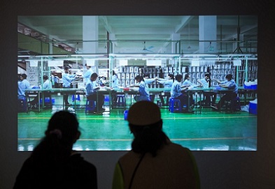
Revital Cohen & Tuur Van Balen, 75 Watt, (product: resin, aluminium, electronics, shown being assembled), video still, 2013.
In between these two anchor exhibits, runs an introductory, but very informative, exploration of sixty years of functional design and 20th century modernism. Shifting Objectives is divided into four regional areas “that have shaped, and been shaped by, design” – these are described as: “post-war reconstruction in Japan, post-independence nation-building in India, collectivization in Mao’s China” and objects from “Hong Kong’s manufacturing and export heyday.” A fifth area, “revisiting postmodernism”, is of more recent practices and anticipates further investigation in the areas of craft, assemblages of found objects, digitally-enabled design, the re-use of text and images, and the “evolving notions of copying” by the M+ design team.
Walking around the displays was a delight. Comparisons between different places in Asia and time periods sees regional approaches, interactions and responses to modernism visually linked. The design of the 1964 Tokyo Olympics poster by Kamekura Yusaku can be compared alongside Henry Steiner’s 1974 ‘Progress Hong Kong’ brochure. Each designer uses universal visual prompts or visual symbolism known to the audience; Kamekura features a large red sun to denote ‘Japan’, while Steiner embraces the progressive-republican colours of red, white and blue to visually emphasize the printed word, ‘Progress.’ The resulting graphic form by each designer is of minimal text and absolute balance.
Le Corbusier, the Swiss- French architect, was commissioned to design from scratch the Indian city of Chandigarh. His 1950s unadorned architecture was a bellwether for the region; and, whose later proponents include Geoffrey Bawa in Sri Lanka and Vann Molyvann in Cambodia. On display is one of the city’s concrete encased lights – a simple curved form, but appearing overly-bulky in this tight display. Charlotte Perriand, a collaborator of Le Corbusier, similarly uses transnational references for a light stand she designed for herself while living in Brazil. Inspired by a trip to the Amazon, she designed her stand as a twisted iron bar supporting paper shades designed by the Japanese-American artist Isamu Nogushi.
Le Corbusier’s cousin, Pierre Jeanneret, became Chandigarh’s Chief Architect and designed much of the utilitarian office furniture for the city’s public buildings. He adapted his designs by using climate-appropriate materials, including teak and cane. His furniture is similar in design and material as used around Asia at the same time, including in The Philippines, Singapore and Hong Kong.
Hong Kong’s neon-lit signage gave the city a distinct and unique urban ambience. Over the last five years, scores of overhead neon lighting have been removed due to overly-officious government safety regulations. It is incredibly sad that few real street-side originals remain; now, we only have the graphic designs, museum preserved, left. These, often flashing, bright lights were the ultimate expression of eternal optimism and hope – with Hong Kong’s ubiquitous touch of commercial capitalism thrown in: they were advertising after all! On exhibition is a wall of graphic design for neon lighting signage. Each design is beautifully proportioned, direct in message and pure in form. These archived designs show how much has been lost: Hong Kong’s buildings appear naked and defenceless without their neon-lit signage!
Contemporary design forms also feature and laid-out is Issay Miyake and Fujiwara Dai’s intriguing A-POC (‘A Piece of Cloth’). Embossed on a single, long, stretchable piece of cloth, “a continuous tube”, is an entire outfit that “wearers cut along pre-set seams to detach the garment pieces.” Similarly innovative is Singaporean designer Hans Tan’s Spotted Nonya. He uses the common Straits Chinese Peranakan porcelain to create a new ‘look’ by placing vinyl sticker dots over the original porcelain and then sandblasting. The original design is eroded away, leaving a Benday dot-like pattern that “evokes mechanical printing processes while blurring the distinctions between tradition and reinvention, and handmade and machine-made reproduction.”
The design collected by M+ and introduced in Shifting Objectives hopefully brings a further appreciation of Hong Kong’s own design history and of its intact modernist treasures. A visit to Wah Fu Estate will show sensible open spaces, modest built forms and open, breeze-catching architecture and whose design comes from the same modernist ideology as Le Corbusier’s Chandigarh and Oscar Niemeyer’s Brasilia.
However, Wah Fu will soon be demolished, replaced by anonymous tower blocks – unless there is a radical reassessment of Hong Kong’s entire urban design and development policies. So, will this unique piece of Hong Kong urban history merely be an architectural drawing kept by our museums and displayed for us to bemoan its loss?
This article was originally published in Paroles magazine, February-April 2017.