
藝評
'Jack Tworkov 1900-1982: Pioneer of Abstract Expressionism – A Survey'
祈大衛 (David CLARKE)
at 9:18pm on 28th April 2026

Figure 1 (above): Jack Tworkov, Games III, 1956. Oil on canvas, 97.2 x 111.8 cm (38 ¼ x44 in.) Signed: “Tworkov”. Prager Family Collection. © 2026 The Estate of Jack Tworkov / Licensed by Artists Rights Society (ARS), NY. Courtesy DE SARTHE, Hong Kong.
(A review of the exhibition Jack Tworkov 1900-1982: Pioneer of Abstract Expressionism – A Survey at de Sarthe Gallery, Hong Kong, 21 March 2026 to 9 May 2026)
Jack Tworkov 1900-1982: Pioneer of Abstract Expressionism – A Survey
by David Clarke
Like many other American artists of his generation, Jack Tworkov (1900-1982) was born elsewhere. His place of birth was Biała Podlaska, at that time a part of the Russian Empire, although now in reunified Poland. He arrived in the United States in 1913 as Yakov Tworkovsky – as with a lot of other migrants his name was anglicized following arrival. He studied art at the Art Students League in New York, and was later to be one of the artists participating in the Federal Art Project (as part of Franklin D. Roosevelt’s Work Projects Administration which provided public employment during the Great Depression). At that time he came to know Willem de Kooning, and in due course other American modernist artists who are commonly grouped together as the Abstract Expressionists (although not all of their art is abstract or can usefully be described as expressionistic).
Certain of the Abstract Expressionists produced works with an ‘all over’ quality – paintings in which an analogous vocabulary of marks is employed across the whole surface, thus giving an immediately noticeable unity to the image. Most prominent amongst those who did this is Jackson Pollock. (1) Earlier artists were also concerned with achieving a sense of compositional unity, of course, but usually in European modernist painting one has a sense of it as something achieved from the organization of disparate forms and colours on the surface – unity as an end result rather than something there from the start. This is the case with artists as diverse as Cézanne, Picasso or Mondrian. Another way in which a sense of immediate pictorial unity was created by Abstract Expressionist artists was by producing paintings with a more or less homogenous colour scheme. Such ‘colour field paintings’ are found in the mature work of Mark Rothko and Barnett Newman, for instance.
Tworkov’s painting follows neither of these two strategies, so in that respect he has more in common with de Kooning, who retains a stronger link to European modernist tendencies than the other Abstract Expressionist artists already mentioned. De Kooning did produce works with something of an ‘all over’ quality at the end of the 1940s, such as Excavation (1950, oil on canvas), but his later paintings abandon it. Indeed, his early 1950s works show him backing off from abstraction altogether, with the theme of the female body becoming central for him at that time (for example in Woman I, 1950-52, oil and metallic paint on canvas). Naturally this means that a sense of figure and background returns to his work, and even though he is of course concerned to link forms across the canvas surface compositionally there is no longer any ‘all over’ feel. In the work of his early maturity Tworkov also retains a greater sense of forms ‘within’ a painting rather than insisting on a unified feel, although he does not follow de Kooning back to figurative subject matter. After becoming an abstract artist he remains one for the rest of his life, stating at one point his belief that a work of art should exist as a thing in the world in its own right, rather than merely playing a secondary role by representing other things.
Closest in idiom to de Kooning than any other painting in the major exhibition Jack Tworkov 1900-1982: Pioneer of Abstract Expressionism – A Survey (held at de Sarthe, Hong Kong, 21 March to 9 May 2026) is his Study for ‘Sirens’ (1951, oil on paper mounted on Homosote). This is a work dating from before his painting becomes fully abstract, and like de Kooning’s art of that time it features the female body, presented in a fragmented post-Cubist manner. One has a sense of forms relating to forms across the surface of the image, rather than being struck first and foremost by a sense of unity. Prominent (but often partial) outlining gives those forms individual identity, whilst the reduced colour scheme (primarily red and yellow) helps link them. White is also widely used, and it serves to unify figure and background, flattening out space and reaffirming the two-dimensionality of the painting.
More fully abstract is a work of a few years later – Games III (1956, oil on canvas) [see Figure 1 - above]. That sense of a dialogue with the manner of de Kooning has disappeared by this point, and Tworkov has now found a style that is entirely his own. One still has a sense of distinct forms rather than an ‘all over’ unity – but this time those forms are more geometric than organic in nature. Picked out in red they occupy a central position in the image, and help create a strong horizontal accent within the painting (another horizontal accent appears towards the top of the painting too). In contrast to that horizontality and static geometrical quality are the dynamic gestural marks found across the whole painting surface. Prominent as they are, those marks do not succeed in overwhelming the geometrical forms. They do however counter the horizontal emphasis by introducing a pronounced vertical one. All the linear marks align in their orientation, being not just vertical but also slightly diagonal or off-tilt in nature.
In Five Spot (1960, oil on linen) [see Figure 2] there are no geometrical forms analogous to those in Games III. Here the gestural marks have themselves taken their place. Reduced in number (and thus no longer occupying the whole surface of the painting) they have also grown in scale. Black in colour, these dynamic forms dominate the image, being placed against patches of blue and red. These patches are relatively homogeneous, and therefore read as static in comparison with their active linear black counterparts. One has almost a sense of gravity, with the red area seemingly a sort of base on which the black forms dance. The blue area is much larger than the red below it, but also more broken up – a white background is visible at various points, creating a tonal contrast with the black forms. Such a vocabulary of prominent interacting black gestural marks recalls somewhat the idiom of Franz Kline, who used such forms throughout his mature work. Kline’s Chief (1950, oil on canvas) is one early example of this.

Figure 2: Jack Tworkov, Five Spot, 1960. Oil on linen, 132.7 x 101.6 cm (52 1/4 x 40 in.). Signed and dated: "Tworkov '60"; titled with dimensions verso upper left: "5-Spot / 52 x 40"; signed and dated verso upper right: "Tworkov / 60". © 2026 The Estate of Jack Tworkov / Licensed by Artists Rights Society (ARS), NY. Courtesy DE SARTHE, Hong Kong.
In Tworkov’s Strait (1965, oil on canvas) [see Figure 3] we again see a contrast between patches and linear forms, but the linear forms are perhaps closer to those in Games III in that they are orientated vertically. The difference now is that they are much more regular in appearance, forming a unified layer on front of the patches. They are longer - reaching the entire length of the canvas – and appear at regular intervals across it like some sort of screen. There is less sense of them as manual gestures, as traces of a hand’s activity in space. Colour is less central now – the primary contrasts are more tonal than colouristic.

Figure 3: Jack Tworkov, Strait, 1965. Oil on canvas, 203.5 x 190.8 cm (80 1/8 x 75 1/8 in.). Titled with dimension verso upper left: "Strait / 80 x 75"; signed and dated verso upper right: "Tworkov / 1965". © 2026 The Estate of Jack Tworkov / Licensed by Artists Rights Society (ARS), NY. Courtesy DE SARTHE, Hong Kong.
In Q4-72 #1 (1972, oil on canvas) [see Figure 4] vertical marks are once more prominent. As with their counterparts in Strait there is a regularity of appearance which again discourages us from reading them as gestural traces. This time however the marks are short, and since they are almost in horizontal sets their verticality is less insistent. Their arrangement across the surface of the image echoes the horizon-like prominent top edge of the darker form towards the bottom of the image. Once again colour is relatively muted, with distinctions of a tonal nature carrying more weight.
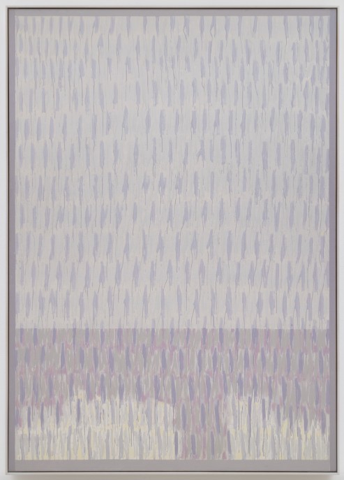
Figure 4: Jack Tworkov, Q4-72 #1, 1972. Oil on canvas, 243.8 x 172.7 cm (96 x 68 in.). Titled and inscribed with dimensions verso upper left: "Q4-72 #1 / 96 x 68"; inscribed with directional arrow verso upper center: "Top"; signed and dated verso upper right: "Tworkov / P't '72"; inscribed with date and title verso on stretcher bar: "Fin. 10-7-72 / Q4-72 #1". © 2026 The Estate of Jack Tworkov / Licensed by Artists Rights Society (ARS), NY. Courtesy DE SARTHE, Hong Kong.
In Diptych for Wally (Q1-82 #1) (1982, oil on canvas) [see Figure 5], which dates from the final year of Tworkov’s life, geometry is insistently present. Unmodulated colour obediently helps to demarcate the image into separate sections across the painting, which is made of two identically-sized panels. A large work, it has a total dimension of 228.6 x 381 cm (90 x 150 inches). The grey band in the centre of the image (which crosses the boundary between the two panels) is wider than those which employ the other two colours featured. However (partly because those other pairs of bands are of regular width) one can imagine the narrower grey bands at the edge of the image as continuing beyond the edge of the canvas, as being of similar dimensions to their visible counterpart. Alternatively, if one chooses to retain a sense of the work as being constituted of two panels, one might wish to see the central grey area as made up of two separate parts, belonging to the right and left edge of the respective panels. One would then read each panel as having a wider grey band at its right edge than at its left edge (grey being the only colour allowed that leeway).
 Figure 5: Jack Tworkov, Diptych for Wally (Q1- 82 #1), 1982. Oil on canvas, 228.6 x 381 cm (90 x 150 in.). 228.6 x 190.5 cm (90 x 75 in.) (Each). Panel A: Inscribed on tape upper left: "A"; inscribed on tape verso on center left stretcher bar with directional arrow: "← B"; inscribed with dimensions left canvas each center: "90 x 75". Panel B: Inscribed on tape verso on center right stretcher bar with directional arrow: "B →". © 2026 The Estate of Jack Tworkov / Licensed by Artists Rights Society (ARS), NY. Courtesy DE SARTHE, Hong Kong.
Counterbalancing the vertical divisions of the canvas is a single continuous horizontal block slightly above the centre of the image. This relatively straightforward dialogue of verticals and horizontals is complicated by two linked ‘V’ shapes which cut across the image, introducing diagonal accents. The horizontal band is accorded a darker tonality than the vertical ones, but the diagonal forms are given a lighter tone. Consequently they can read as being in front of the horizontal and vertical forms. Not only are they ‘disobedient’ to the vertical and horizontal logic governing the rest of the image, they are also the only element which is irregular. The two arms of each ‘V’ shape differ from each other in their dimensions. Furthermore, the two ‘V’ shapes are not identical to one another. The bottom of the right hand ‘V’ sits in the green band, whereas the bottom of the left hand ‘V’ (which is altogether fatter than its counterpart) is over in the grey band.
A further complication of the basic geometrical language of the work comes from a multiplicity of linear marks which cover its entire surface. These recall the vertically-orientated marks we have seen in various other Tworkov works of earlier date, but are considerably smaller. Consequently they tend to lack individual visual presence, not coming across as distinct gestures. They don’t really interact with the hard-edged forms of the painting, and thus read as a layer in front of everything else we can see.
This significant exhibition is I believe the first survey of Tworkov’s work in an Asian context. Although early on in my professional career I did research on American art of the period during which Tworkov was active I saw relatively little of his art at that time. I was studying for my PhD at the Courtauld Institute of Art in London, and a major show of Tworkov’s work came to the United Kingdom in 1979 during the time of my study. Unfortunately I missed it since that exhibition took place exactly during the period when I was away in the United States doing fieldwork. I was meeting artists associated with Abstract Expressionism during that time (such as Philip Guston and Richard Pousette-Dart), and was talking to other such artists on the phone (such as Robert Motherwell and Lee Krasner), but because Tworkov’s work did not coincide with the themes I was researching I never attempted to reach out to him for an interview. (2) This is the first occasion I have had the opportunity for a significant encounter with his work.
Notes:
1: Pollock is certainly the most well-known of the artists to produce ‘all-over’ paintings, but he is not the first. Mark Tobey was doing something similar at an earlier date. Although the term is generally employed in relation to painting an analogous tendency can also be seen in the work of certain sculptors of that era, such as Ibram Lassaw. I discuss both Tobey and Lassaw in David Clarke, `The All-Over Image: Meaning in Abstract Art`, Journal of American Studies, Vol. 27, No. 3, 1993, p. 355-375. Both artists are also discussed in David Clarke, The Influence of Oriental Thought on Postwar American Painting and Sculpture, New York and London, Garland Publishing, 1988.
2: All these artists (as well as a number of others) are discussed in David Clarke, The Influence of Oriental Thought on Postwar American Painting and Sculpture, New York and London, Garland Publishing, 1988. Amongst artists whose work was relevant to my research, but whom I was unable to interview, was Sam Francis. In addition to discussion of his work in that book I also consider it in an article: David Clarke, ‘A Friendship: Sam Francis and Walasse Ting’, Asian Art News, Vol. 30, No. 4, 2020, p. 58-61. When I was visiting Ibram Lassaw in 1979 he took me to visit the graves of Jackson Pollock and Ad Reinhardt in the cemetery at East Hampton. On the way back he planned to take me to visit his friend and neighbour Willem de Kooning, but because that artist had just had his drive resurfaced we were unable to enter his property, and the chance disappeared. I do write about de Kooning’s art in David Clarke, Water and Art: A Cross-cultural Study of Water as Subject and Medium in Modern and Contemporary Artistic Practice, London, Reaktion Books, 2010.
|
|
|
|
|
|
'Jack Tworkov 1900-1982: Pioneer of Abstract Expressionism – A Survey' |祈大衛 (David CLARKE)
Book Review: ''Media, internet, and social movements in Hong Kong: control and protest'' |約翰百德 (John BATTEN)
Visiting the National Security Exhibition at the Hong Kong Museum of History |約翰百德 (John BATTEN)